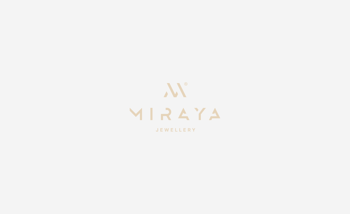
Miraya ® Jewellery
Miraya Jewellery asked us to redesign the logo and the corporate identity.
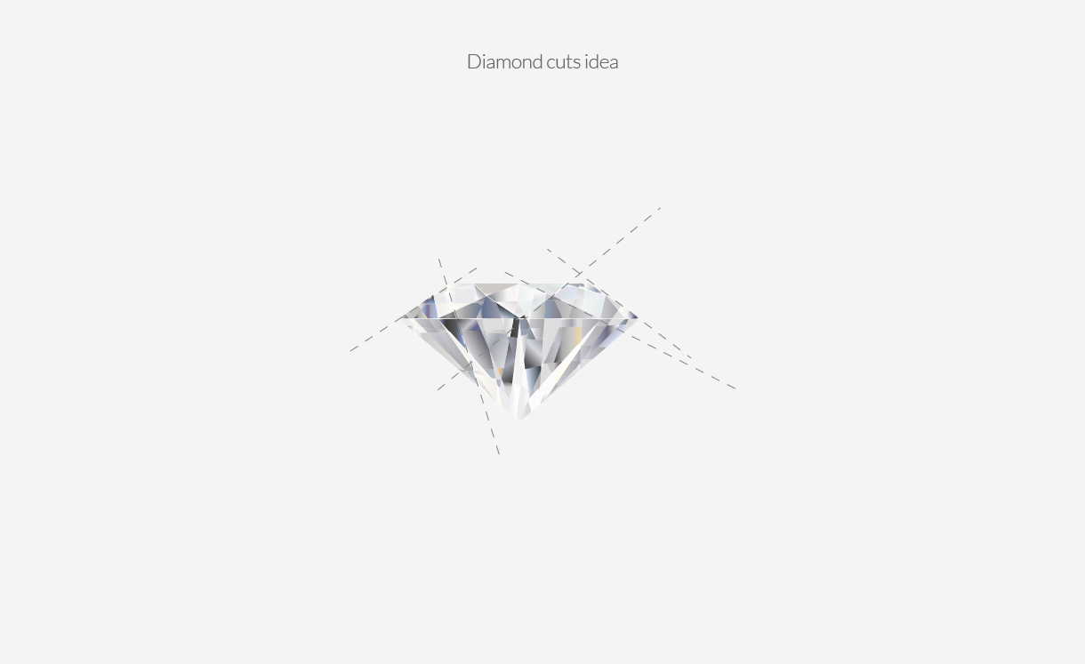
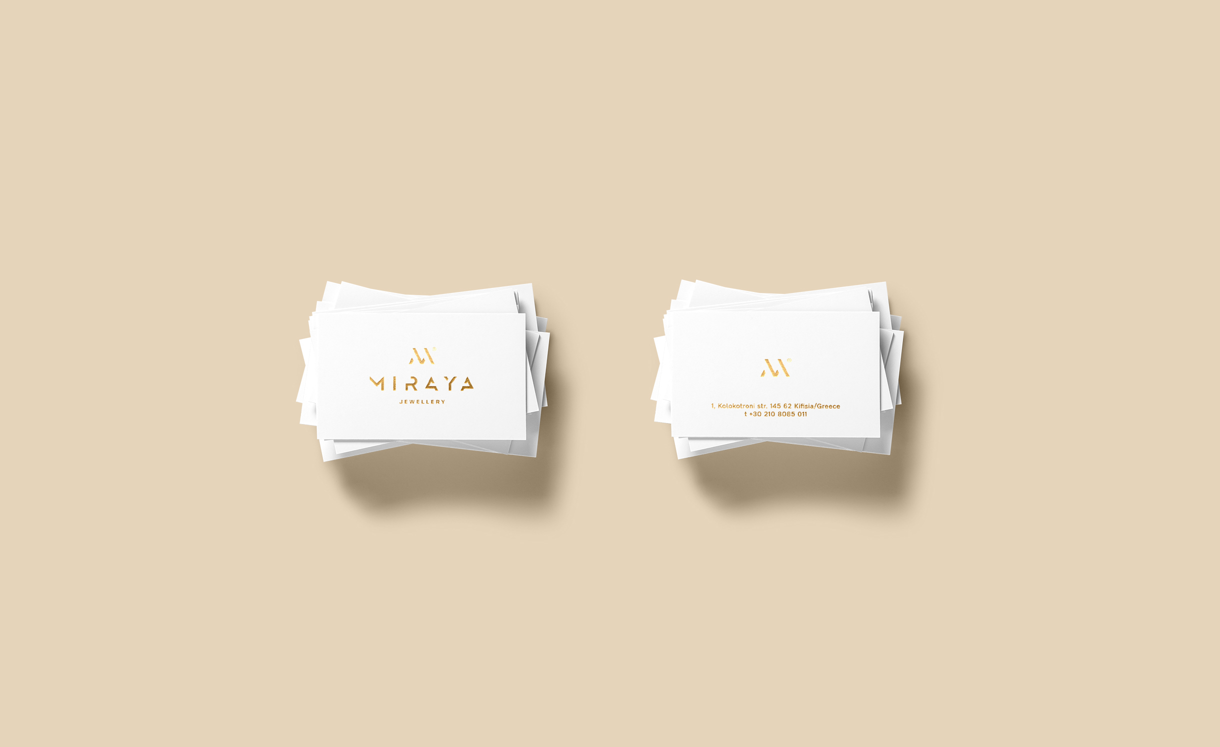
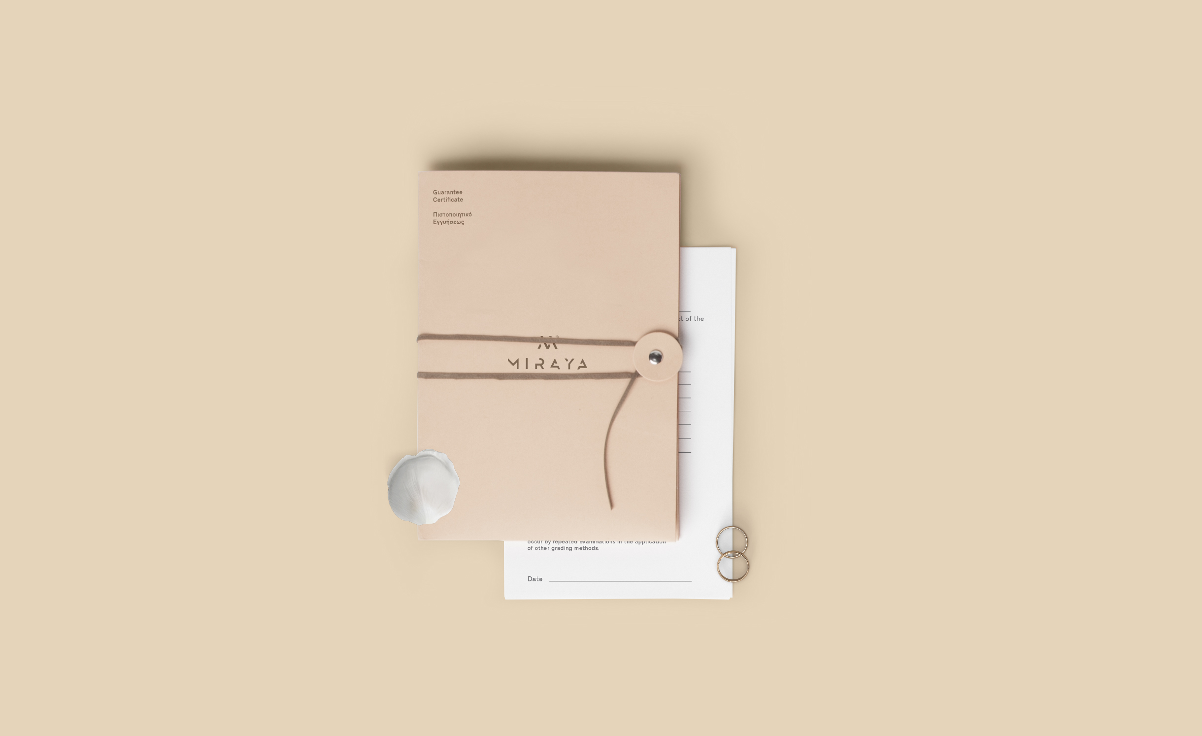
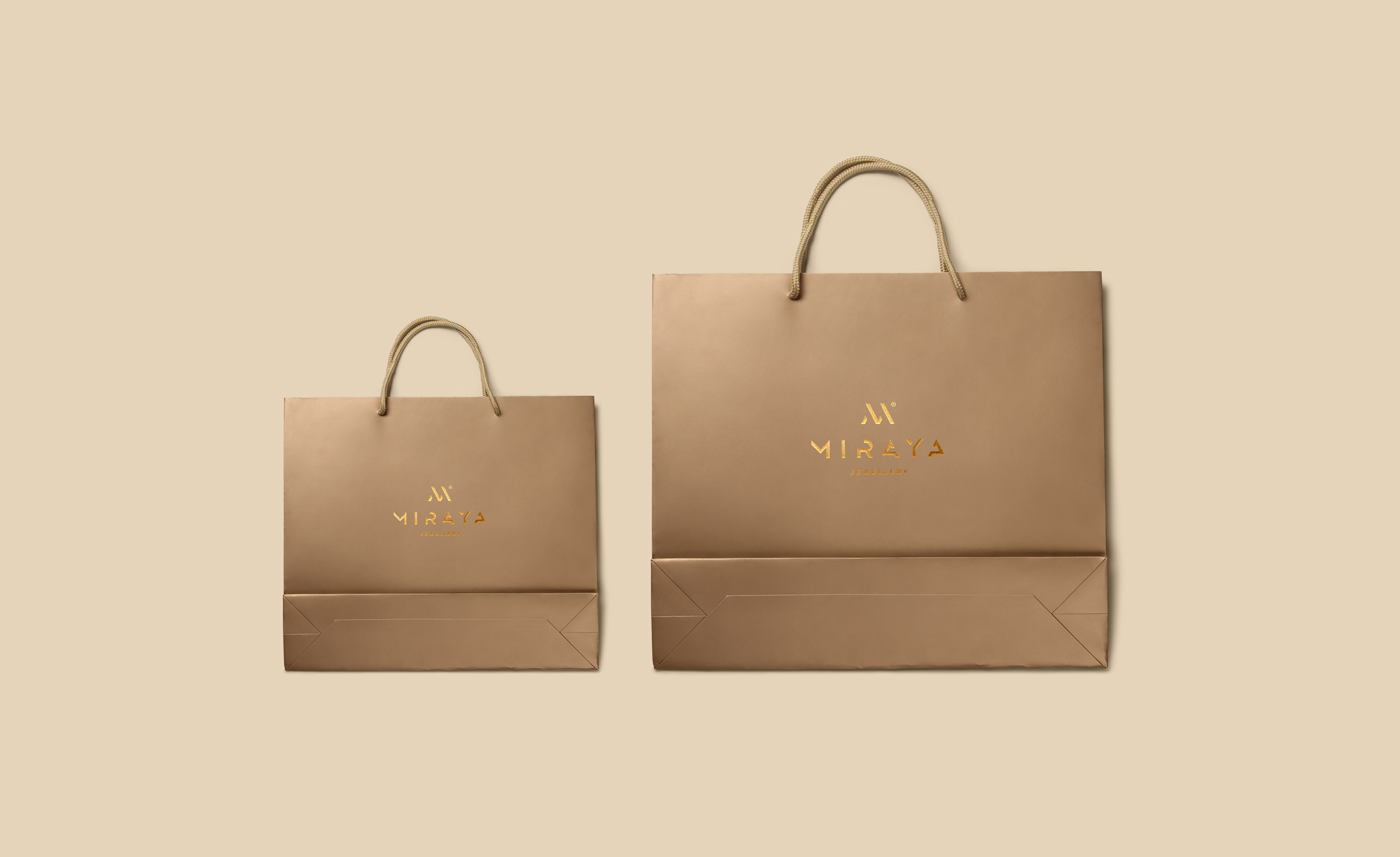
The idea came from the intense and geometric cuts of diamonds.
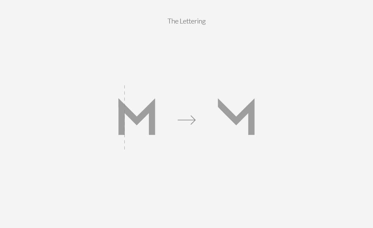
The symbol follows the principle of “continuity” as we can see lines even in the gaps. The lettering of the logo was created from scratch to be consistent to the symbol. All branding was based on the words Minimal, bold and emotional.
Client
- Client: Miraya ® Jewellery
- Year: 2017
- Categories: Branding, Corporate id