Runster ®
Runster is a website addressing to people whose primary exercise is running or even to those who think of starting running as a hobby. The site gives notice, ideas, solutions and instructions to prospective runners in order to inform and innovate in the issue of “running”. The site contains articles in topics such as Running, Fitness, Fashion, Events, Stories, Women, Living and Nutrition, always combined with running. Thus, it covers several questions and needs of those interested in introducing in their lives running as a form of exercise.
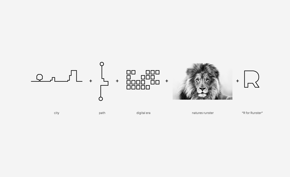
The survey has offered us many “key words”. After having collected these words, we began separating them, choosing the ones that stand for this particular brand.
The city. All people who exercise by running, do it mostly in the cities where they live.
The itinerary. Each runner selects a route, either short and brief or long, always setting however the starting and finishing point.
The digital era. It could not be missing, since the whole world involves around the web and Runster, too, as a brand is a “digital” media firm.
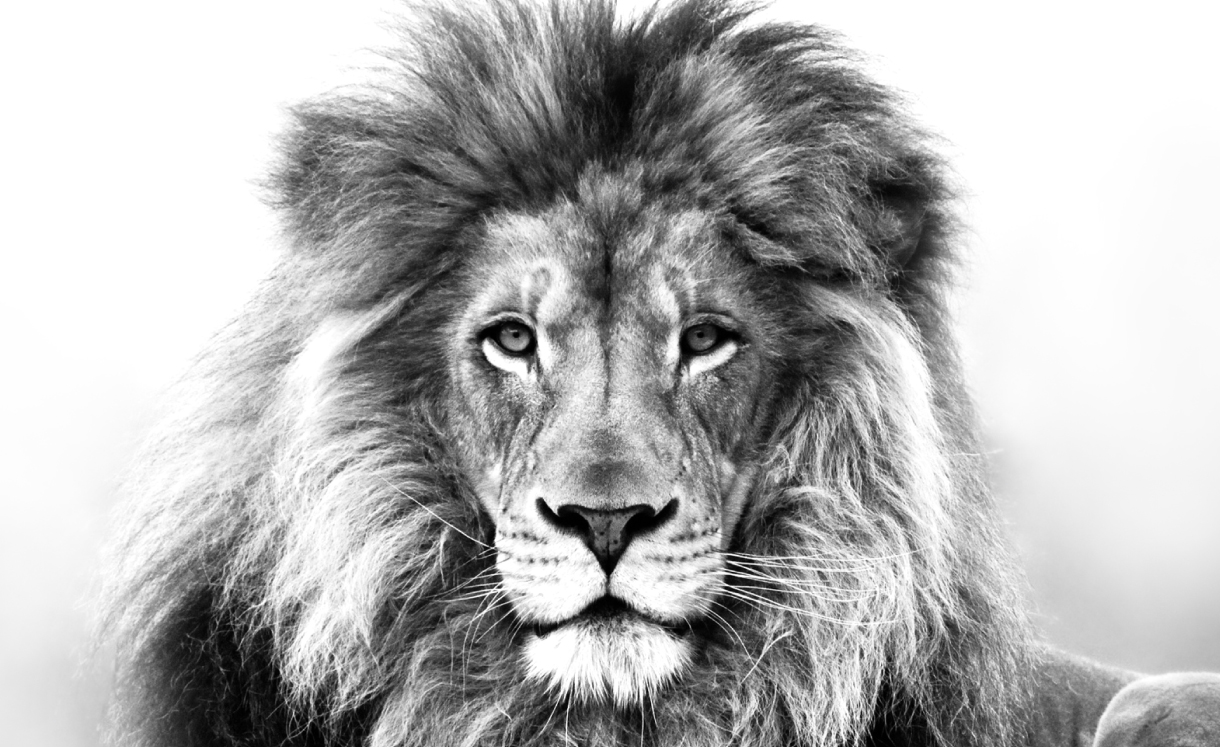
The lion. We searched in nature for the authentic Runster. According to the etymology of the word, we discovered that a Runster is a relaxed guy, who will run the first day, but the next one may not, who will run 2km on one day, but 6km on another. Commonly, he isn’t the well-known “core runner”, but a man who simply runs for sport and well-being. Thus, this meaning was tied to the lion, which will run on its prey on some days while will find it ready and won’t cover any distance on other days.
The “R”. In our solution, we decided for all of the above to be linked with the initial letter of Runster.
Our final solution basically consists of the keywords which we visualized in a quite particular style. The logo joins all these ideas and becomes one. The city, the itinerary, the digital era and the lion become one and form the letter “R”.
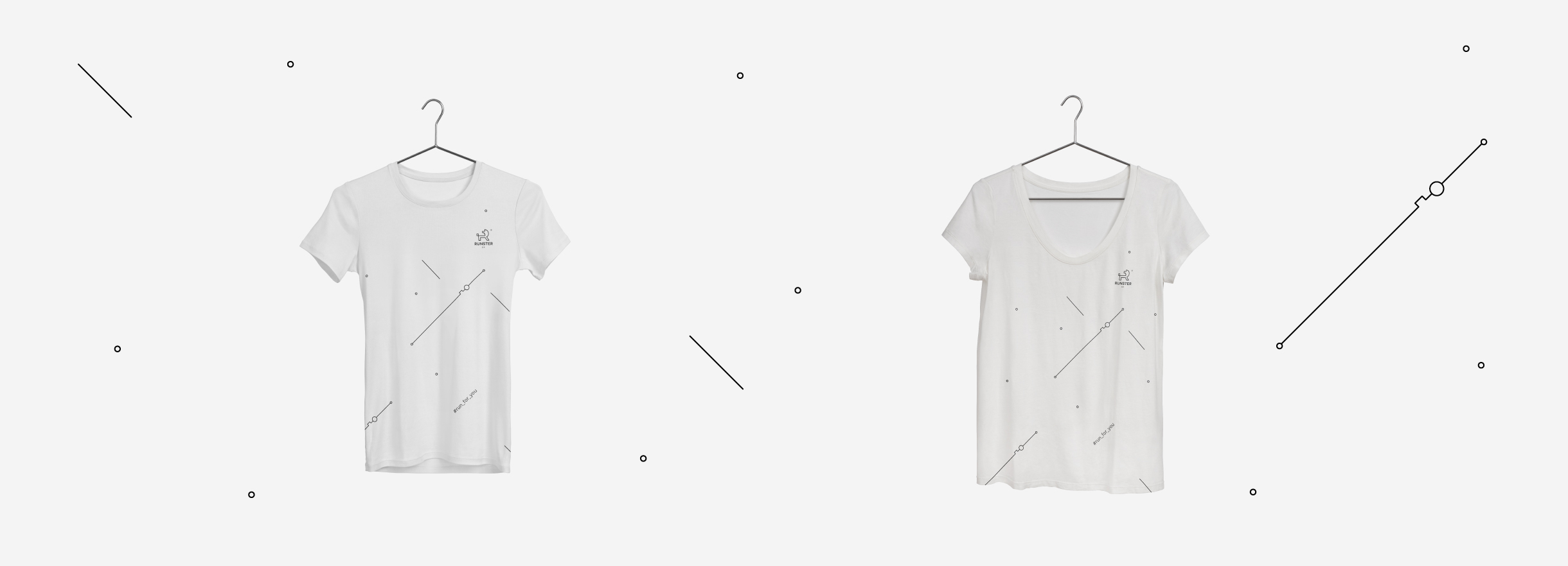
But why is the lion looking back? It’s definitely not by chance. It’s because he is the pioneer and the only one who controls what happens behind him. The use of only one color is the element which will mark the brand, but will also facilitate its different applications, since the sector of running already includes a lot of color. The font (San Francisco Text), remains simple, clean but “heavy” and constant, as every runster’s steps should be, illustrating at the same time the consistency of the brand.
Client
- Client: Runster ®
- Year: 2014 since today
- Categories: Branding